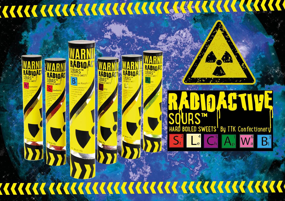
I was shopping with my wife and daughter in my hometown Tongeren and we came at this candy store called Snoeptime. My daughter (who was 7 years old at the time) quickly ran inside as she was on some kind of “pre sugar rush” already. As my wife and I tagged along we picked out some candy for ourselves as well (DUH). When all of a sudden I saw these “radioactive sours”! Of course I noticed them out of the 6000 other kinds of treats in there… After more than 10 years that I created my very first font “Parents Suck”, there it was in large letters on the front of the box.

The•Treat•kitchen used my font!
I searched the company that made the Radioactive Sours and it turned out to be a UK based company called “The•Treat•kitchen”. I decided to reach out to them asking why they chose my font in particular. This is the reply I got:
“We love your font and it fits in amazingly with our brand, so thank you for creating it, we are glad we did it justice!”
Well, THIS is exactly why someone creates a 100% free font!!
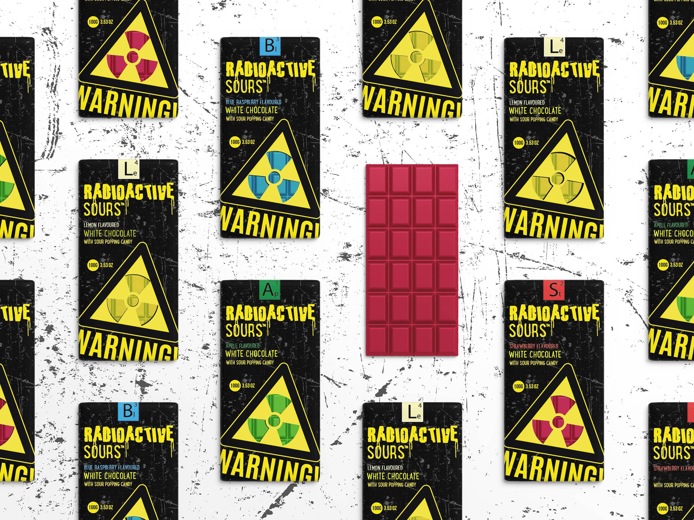
A few emails went back and forward and when I asked for some imagery I could use to highlight the use of my Parents Suck font, they sent me pictures of the product they wanted to highlight… It turned out they have the weirdest thing in their range: SOUR CHOCOLATE!!!

Sour Chocolate WTF!?
I truly have never seen something like sour chocolate before. I think you can’t find something like this anywhere in Belgium. So the nice people at The•Treat•Kitchen in the UK agreed to send me some samples. I can’t wait to try them out! Or can I…? The original Radioactive Sours are really REEEALLY sour!!


